The Hitcher
-
Posts
1407 -
Joined
-
Last visited
-
Days Won
5
Content Type
Profiles
Forums
Gallery
Everything posted by The Hitcher
-
You want a vector file, so really an eps file would be fine. I havent used helvetica, though it is a variation on it called "coolvetica", although theres nothing wrong with it, its a great modern font. Though I much prefer Avenir, Ahoy ahoy typography nerds, unite!
-
Coheed and Cambria - Wake up
-
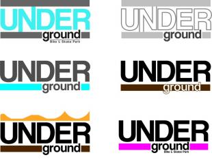
So as not to be racist, a coloured version... Still needs some work though. Edit: some colours look different due to computer. Buggery poo.
-
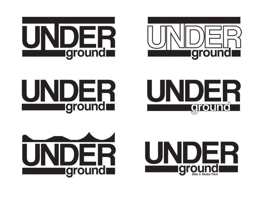
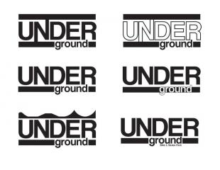
Couple of ideas for your perusal... No colour as wanted feedback for black and white first... Enjoy
-
I couldn't agree more with what Bronz has said. Nothing comes for free in this world, but it is always nice to do a piece for free or for charity to help out, plus it expands your portfolio, but a little free rain goes a long way. Even if a client is paying for my services I would still tell them that 'a bad idea' of theirs is a bad idea, otherwise whats the point in creating anything. The whole point of employing a designer is because they know what they are doing, anyone can pull a piece of design out there arse, but I can guarantee it wont be as good as someone trained in the industry. Personally I don't think you need such a large blank area behind the logo, you can set this up in the logo use guidelines, i.e the logo must always have a 10mm gap between any surrounding images/text/etc. (edit. just released this is whats been set already, opps) What sort of sizes, in measurements, will this logo need to work at? Cant make the typography to fine and not be able to read it, and the same for too bold.
-
Is it called 'ground under'? as this is how it looks to read... Does the black background need to be so large around the typography?
-
Love these frames. Looks so nice, blue and white is spot on!
-
Over and over again. Light and solid.
-

Looking For Beginner/intermediate Trialists In Dorset
The Hitcher replied to SamLJ92's topic in Beginners Trials Chat
West Bay, near Bridport if you can travel. Great street plus tonnes of rocks and what not. I live down there, but in Plymouth currently but will be home over easter if anyone fancies a ride. Can drive up to poole I spose, but not that great up there really. Will keep an eye out if anyone organises a ride and try to get there. -
You sir are a filthy tease! I need that bash!
-
My illustrator effort... Please note the tarty stabilisers and bell. Be safe kids!

-
BOTI if the link works.
-
Makes no sense, but hey ho. Personally think it looks tidy as you like. Get some high rise bars and it'd be perfect! (well for me anyways)
-
Very nice indeed, needs some white pedals though. What bash is that? Atomz? Does it fit square to the cranks or is there a spacer, as I've got same cranks and need a bash to fit.
-
Constructive criticism: No Lime green, hard to need over that speckled background. Give your logo a rethink, looks like a five minute jobby on word. The navigation text looks like its pixelating? Also a bit more spacing between paragraphs as people wont bother reading big chunks of text. News at the top and the about paragraph in the about section. What are you using to build the site? And what sort of slideshow do you want? Gif? or Flash or...?
-
...what be it?
-
Ill stick to crack thanks.
-
White looks tight. Is that a because bash?
-
-
Apologies if this has been asked, but are you selling the stems separately or will they just be on the full builds? Onza has definitely stepped up its game on these new builds, they look real tidy, wish I had this choice when I started trials.
-
What about using some tensile offset mounts, but reversing them? Or will the slave catch? O by the way, its piston not pistone
-
Do a search using the members tab at the top of the forum, and use the advance filters, specifying leeds (or wherever) as the location, itll bring up a list of everyone on here from that area. Not sure whats wrong with your hub, what make is it? Maybe not tight enough, checked it over?
-
Was that a real pedo? Nice video, agree with Mr Hynes, does make natural look fun.
-
Loved it, though I admit sometimes I can get a bit bored of "Danny Mac Style street" riding, just as I can with TGS, natural and everything else. But... its the fact that each time I see a video there's something new or a move that makes me go "shit, that's nuts" plus with great editing it makes the video enjoyable to watch and makes me want to go out ride and try something other than side hopping a wall or dropping a nice gap. f**k the Haters, Trials is becoming way to 'scene'
-
So what, does this mean all TGS riders are following the Craig lee scott / Tunnicliffe bandwagon, according to your point yes, but does anyone bitch and whine about it like they do with 24 street style, no. Trials has evolved to encompass loads of styles which I think is what is helping the sport get more recognition and publicity and also what keeps older riders interested and younger ones joining in. Chase Hawk (not having a go at him, as he's got a shit lot of skill) doesn't own his style, so f**k it if someone other than a Bmxer decides to try something similar. Imitation is the best form of flattery.